What is Amazon SageMaker Unified Studio?
Amazon SageMaker Unified Studio is a data and AI platform that brings together AI and analytics services together into an integrated experience, to enable data processing, SQL analytics, model development and training, and generative AI. With a unified studio, you can access and act on all your data using the best tool for the job.
Timeframe: Jan 2024 - Dec 2025
My role and impact
〰️
My role and impact 〰️
Within 1 week of launch, 600 external paying accounts have tried SageMaker Unified Studio
Led the designs from concepts to launch of project foundations within SageMaker Unified Studio, focusing on simplifying complex data and compute management workflows
Navigated through ambiguity while collaborating closely with cross-functional teams across multiple organizations to uncover and define requirements
Presented end-to-end user journeys across the product to senior leadership, effectively communicating design rationale and the value of user-centered design, resulting in increased executive trust and collaboration
Continuously contributed to the ongoing development of our design system by submitting bugs, improving UX on components, overall leading to high standards in maintaining consistency
Participated in a new product launch as a preview in November 2024, and launched for GA on March, 14, 2025
I designed various versions over the 2 year span
Due to my NDA, I am unable to share all my design artifacts publicly. If interested, feel free to reach out as I’m happy to continue the discussion.


Currently, connection management is fragmented across the AWS ecosystem. Several services maintain independent silos, customers are forced to recreate the same data connections repeatedly.
Inconsistent interfaces: Each service uses different forms and terminology to ask for the same information, increasing the user's cognitive load.
Redundant effort: Users must configure the exact same database connection multiple times to use it across different services.
Maintenance debt: If a database password changes, the user must hunt down and update every single instance of that connection, or their data pipelines will break.
The problem
To solve the fragmentation problem, I designed a Unified connection experience within Unified Studio. This redesign consolidated two separate AWS management consoles into a single, cohesive interface where users can manage their connections in one place.
Our goal was to:
Eliminate console hopping
Standardize configuration
Simplify maintenance
Unified experience
The solution
The evolution: From beta to scale (Jan 2024 - Dec 2025)
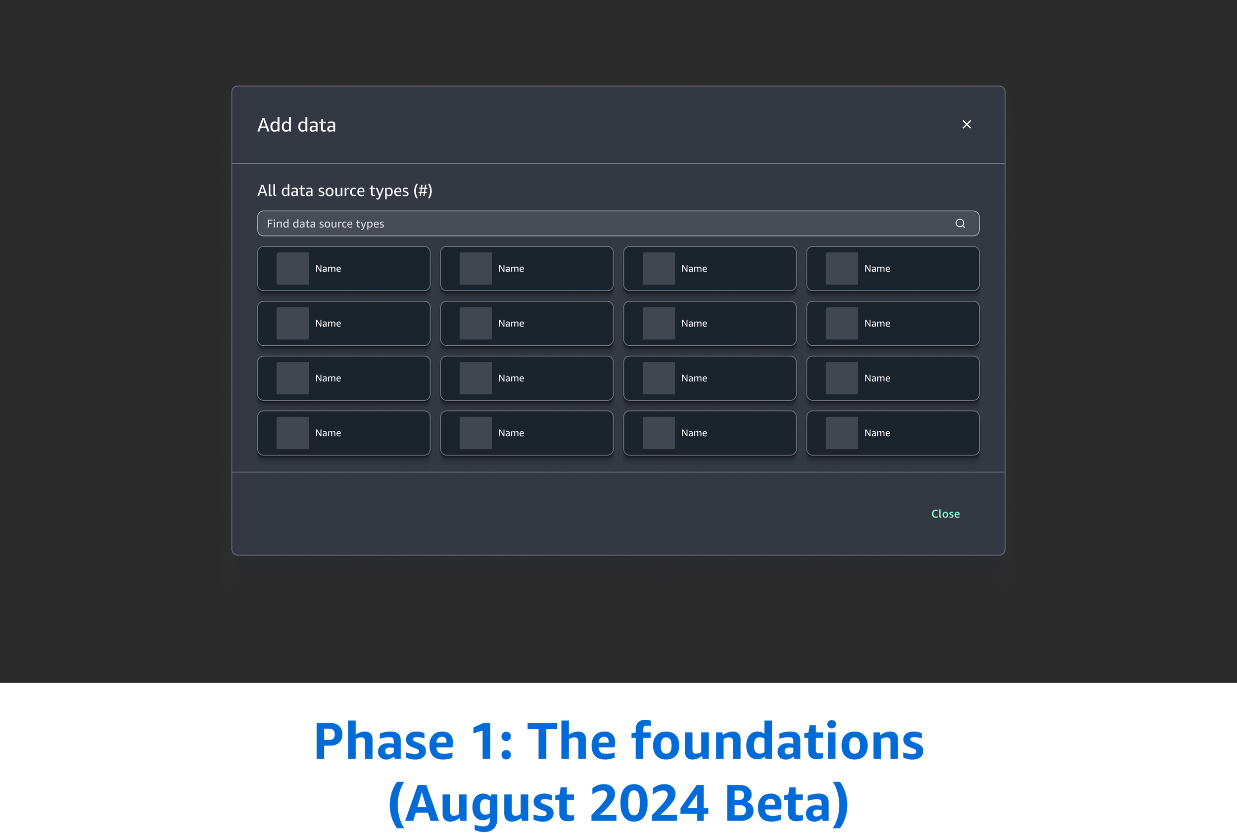
Phase 1: The foundations (August 2024 Beta)
In the current experience, our customers were constantly forced to navigating to a separate page and leave their tool to create a connection.
Our customers expressed a critical need for maintaining their "flow"—the ability to configure their data without abandoning the tool.
The problem
“I don’t want to lose my place or work.”
The experience couldn’t be a multi-page wizard flow; the UX had to be:
Portable
Needs the ability to be opened within a tool
Ingressed at any part of the product
The requirements
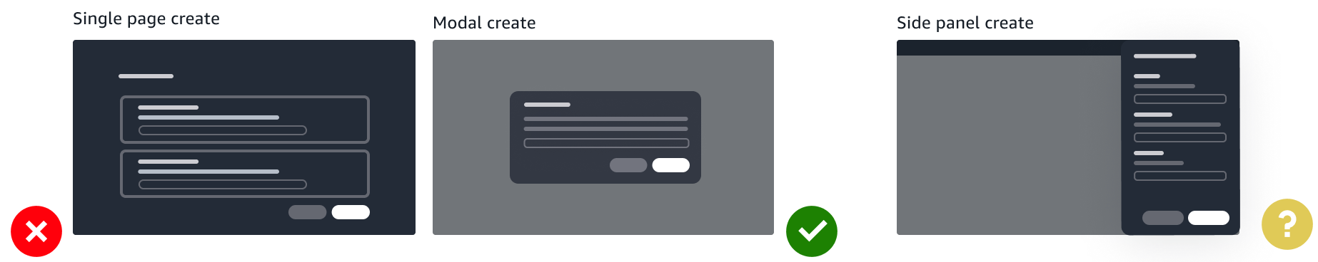
The decisions
While we had the side panel UX in mind as a solution, we ultimately chose the Modal-based UX for the August 2024 Beta. This was a strategic decision driven by three critical constraints:
Tight release deadline
Leveraging existing patterns
The modal UX was already a part of an existing workflow in the tool
Design system evaluation
We were still in the middle of evaluating the design system as a whole. We were not aligned on how all create flows would behave across the product
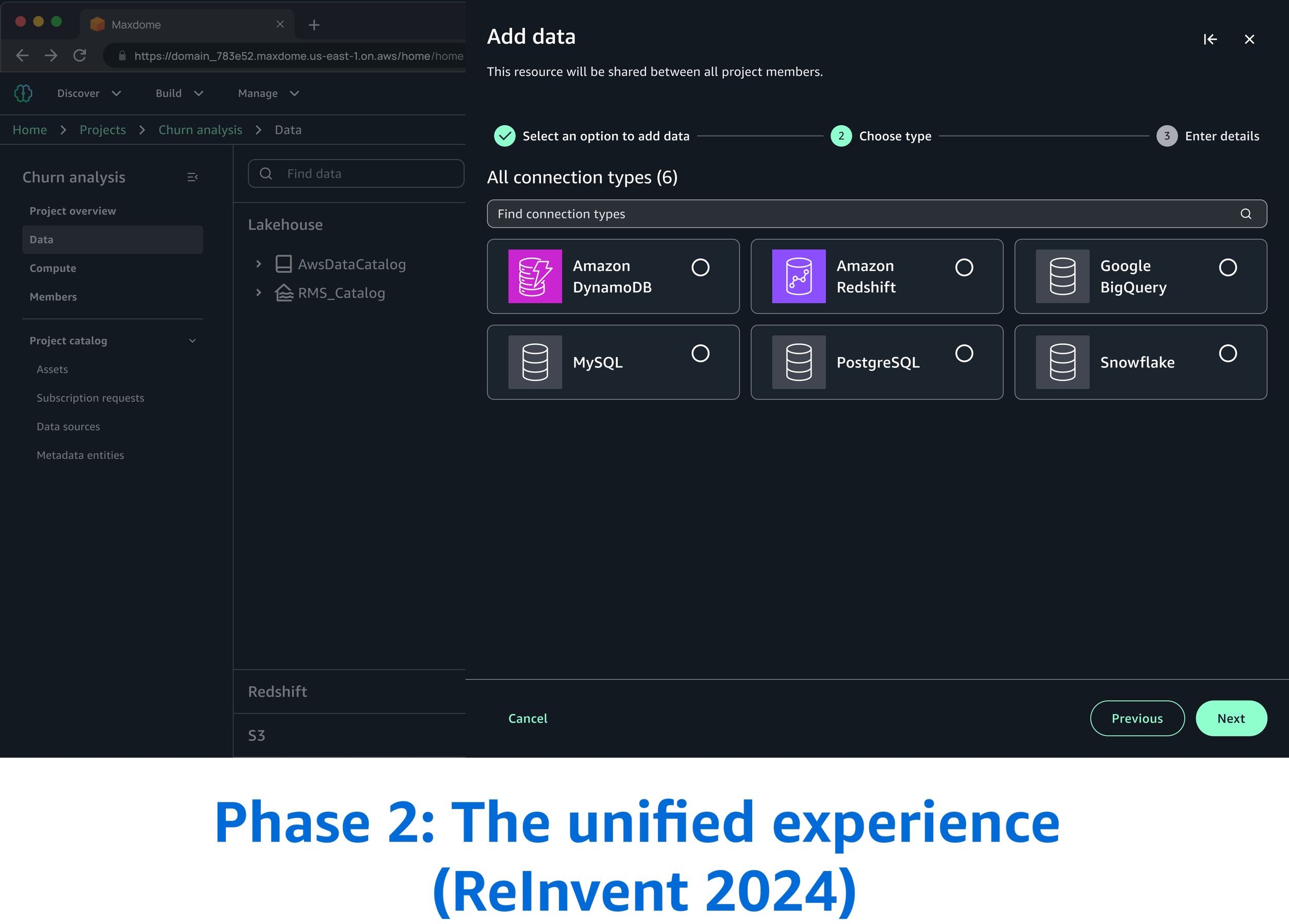
The design pivot post beta launch to ReInvent 2024
Following the August Beta launch, I continued to evaluate the experience. While the initial modal served our immediate "speed-to-market" needs, there were major factors that forced me to re-evaluate the UX for the Public Preview at re:Invent 2024.
Disjoined and inconsistent create patterns
Our team had used modals and another team had built their create flows using side panels
The “nested modal” anti-pattern
Another complex use case emerged in which users needed to perform secondary tasks during the connections flow. This meant opening a modal on top of a modal - which is an anti-pattern. They cause cognitive disorientation and make it nearly impossible for screen-reader users to navigate the layers safely and unaccessible.
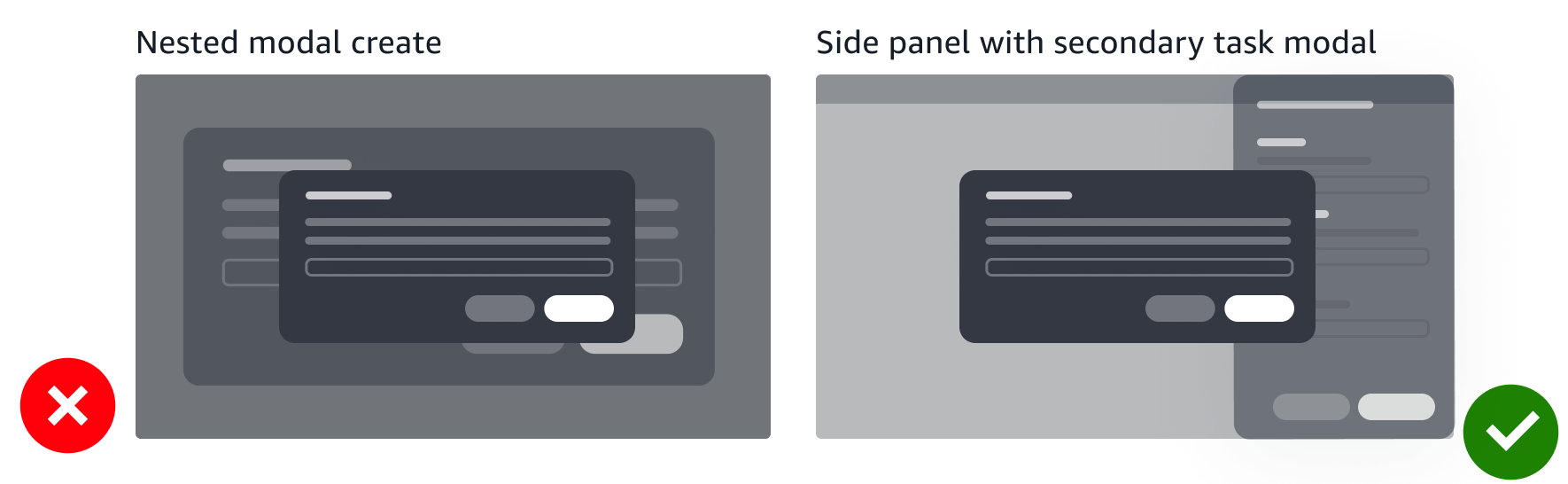
The challenges identified during beta led directly to finalizing the side panel as the interaction pattern.
The engineering challenge: Driving a Re-architecture
“We already have the modal and experience working. Why do we need to rebuild this? It requires refactoring and there’s no time.”
I didn't just argue for "better UI"; I framed the shift as a technical and product necessity:
The “nested modal” anti-pattern argument
I shared the "nested modal" use case and engineering quickly realized that maintaining focus management and state across stacked modals would be more technically difficult (and bug-prone) than the side panel.
The scalability pitch
I shared that the side panel was a standardized pattern across the product. We need to fix it now, rather than later.
Accessibility as a requirement
I shared that the current modal architecture would not pass the accessibility audits required. Screen readers in complex flows cannot navigate the modal. This shifted the conversation from "nice to have" to "required."
The post launch reality: A "mental model" gap
After launching at re:Invent 2024, I continued to monitor user feedback. The data revealed an insight: while the flow was better, the concept and mental model was still failing.
This revealed 2 major pain points from our customers:
Conceptual confusion
Customers didn't fully understand what a "connection" represented and how it worked.
The discovery gap
Even after successfully creating a connection, users couldn't find where to manage it. The connection was buried deep within the product—a result of an original product decision to keep the workspace "clean."
“First thing when you log in, it didn’t tell you about a connection.”
“I created a connection, but now I can’t find it to edit or delete it.”
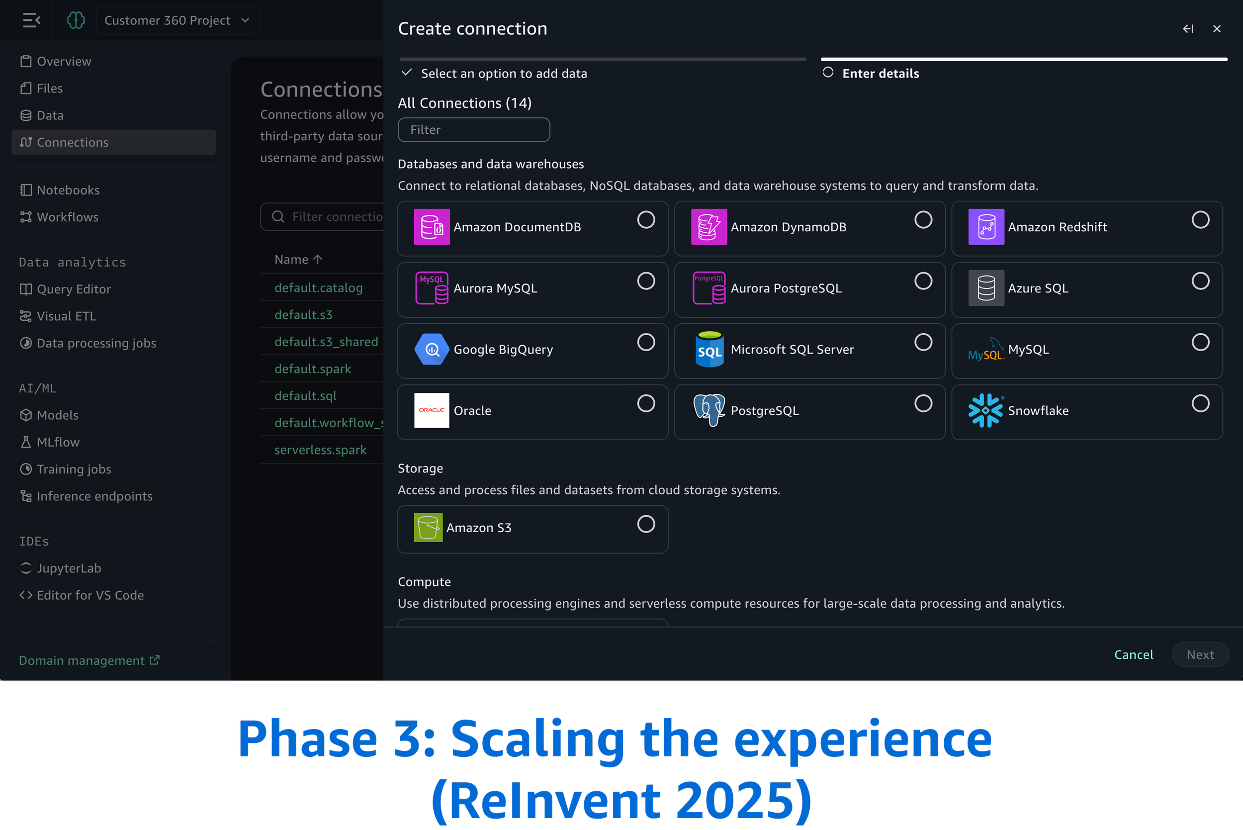
Phase 3: Scaling the experience for ReInvent 2025
To solve the pain points identified Public Preview ReInvent 2024, I established three core requirements for the 2025 release:
The requirements
Increase discoverability
Introduce “Connections” to be a dedicated page in the global navigation
Mental model alignment
Provide clear visibility in the data explorer
UX scale
As we introduce more connection types, users need to be able to understand and find what they need as quick as possible so we categorized the connections

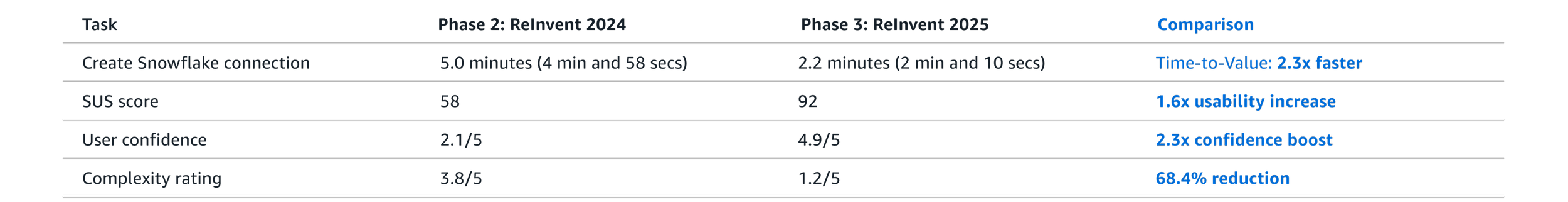
Testing
To validate the design, we utilized the same unmoderated testing script used from Phase 2: ReInvent 2024 experience and compared the data with Phase 3: ReInvent 2025.
Tasks
Create a Snowflake connection
Create a EMR connection
After completing the task, participants answered questions to measure overall complexity and rate their confidence:
Confidence: "I felt very confident that I completed the task successfully."
Ease of use: "I found the steps required to complete this task were very cumbersome to use."
Complexity: "I found the concept of connections unnecessarily complex."
Sample data explorer screens
These are additional requirements that are supplemental to this project, but will not be going in depth.
Overall challenges
Stakeholder management: Balancing the needs and expectations of multiple stakeholders from different organizations can be complex
Inconsistent design languages: Each organization might have its own established design system or visual language, requiring careful negotiation to create a cohesive look and feel
Inconsistent UX maturity: Organizations may have different levels of UX understanding and adoption, requiring education and advocacy efforts
Maintaining UX consistency long-term: Establishing governance to ensure the unified experience remains consistent
Design system in its early stages: Lacking established patterns and a comprehensive component library, I played a key role in defining and shaping the UI, directly impacting the design system's evolution.
If I had more time
Build upon our MVP to develop a comprehensive solution
Refine design iterations further
What I learned
Navigating design disagreements with stakeholders
Found constructive ways to voice concerns while fully committing to the chosen direction
Developed stronger skills in influencing through data and clear communication rather than position or authority
Developed skills in knowing when to push back and when to align with broader team direction