Your Custom Text Here
Workfront
Workfront is a modern work management platform designed to connect people to work and accelerate organizational success across the enterprise. Our mission is to make businesses work better.
During Summer 2018, I was given the opportunity to work at Workfront in Lehi, UT as a UX Design Intern. During my time at Workfront, I was able to integrate knowledge and theory learned in the classroom in a professional environment. I worked with 3 different teams on 4 week rotations.
Cycle 1: Design System
Cycle 2: Documents
Cycle 3: Work Execution (learn more about my process in this project)
ACCOMPLISHMENTS
- Built a rich text editor, drag and drop pattern, and an updated date picker for the design system
- Conducted both moderated and unmoderated user testing sessions
- Built the symbols library for icons
- Fully owned and was responsible for designing the behavior and visual interface of a new product and improved the usability and design of existing product features
- Facilitated design sprints and brainstorming sessions with the developers and engineers
Here are some TLDR screenshots of what I did...
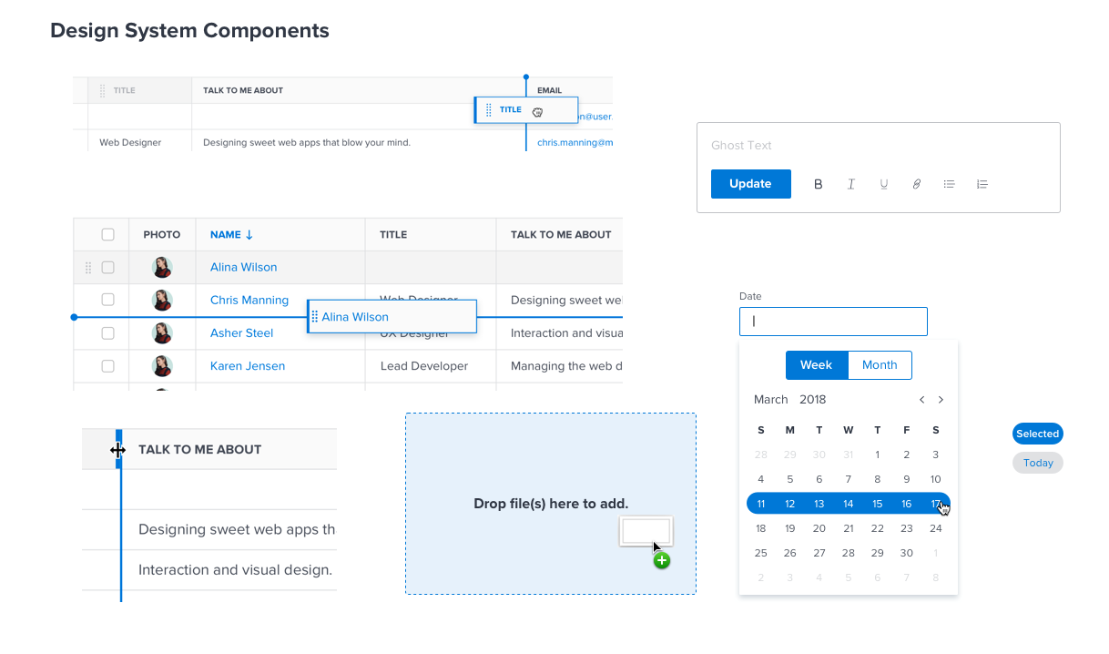


Cycle 1: Design System
During my first month at Workfront, I worked with a senior UX designer on building and defining new components for the design system. I helped build 3 components: rich text editor, date picker, and drag and drop.
THE PROBLEM
Currently, Workfront does not have a design system. There are many inconsistent styles and components within the product.
THE GOAL
By building a design system for Workfront, we can improve usability and create a cohesive design language. It helps increase familiarity with the users due to the standardized components used throughout the whole software. In addition, this can help designers prototype faster.
RICH TEXT EDITOR
THE PROBLEM
There are many places where different styling for the rich text editor exist in the current system. I was tasked to re-create this component based on our use cases and using our new UI patterns.
First, I began by auditing the existing patterns in the system. I found 2 different styles of the rich text editor. I explored other rich text editors.
Then, I created my own iterations and played around with the colors and how it would look like at different states.
FINAL
One main use case we had for the rich text editor was for an update stream. The update stream is also located in a sidebar, so in order to save vertical real estate, I moved the buttons next to the primary button.
DATE PICKER
THE PROBLEM
Our current date picker only allowed users to select a date. I was tasked to update it with a few new use cases:
- users need a way to be able to select month/year quickly
- users need to be able to select a week or month range
EXPLORATION
Some initial sketches and exploration of date pickers.
FINAL
DRAG AND DROP
THE PROBLEM
The drag and drop component occurs in many different places and for different objects. I was tasked to redesign it using our new design system.
TABLE HEADERS AND ROWS
The drag handle indicates that the row is draggable. Displaying a drop line indicates the specific position of where the object will be dropped. Having a "previous state" reminds the user where the original position of the element was while it is being dragged.
RESIZING

Having a drag line appearing allows the user to know which column they are resizing.
DOCUMENTS
Exploration on drag and drop document patterns.
Having a previous state and and a “drop” state allows the user to know that the files they are dragging are in the drop zone.
Cycle 2: Documents
I had the opportunity to fully owned and craft an end-to-end experience of a brand new product while collaborating with PMs and developers. Oftentimes, retrieval of documents is required when internal audits are performed or outside regulatory action requires proof of certain assets. Inside documents, users can store long-term archives within a vault with a set retention policy. Users can visit the vault and retrieve these documents when needed.
During this cycle, I worked on 2 epics: Vault Settings and the Vault Storage Center.
VAULT SETTINGS
THE PROBLEM
Users need a way to set up a vault where they will store long-term documents tied to projects inside of Workfront. Users need a way to oversee all applicable settings for managing their vaults. Within this setup screen, users can create and manage vaults. Users will be able to configure all necessary settings such as vault name, retention policy, access controls, document workflows, and document removal policies.
USER FLOW
I drew out a user flow to better understand and visualize the path the user might take across the solution.

FOLDERS
When I (system administrator) am configuring vault settings, I want the ability to select the location (folder) within the vault, so that assets can be delivered in an automated fashion.
The original solution was to use a modal, but Workfront is moving away from modals, so a potential solution is to select a location through a dropdown.
VAULT STATUS
When I (system administrator) am configuring vault settings, I want the ability to see the current overall status of the vault, so that I can make appropriate changes or lock down the vault.
Once a vault has begin the 24 hr validation cycle (or locked), users may abort the locking process in case settings need to be adjusted. A timer will be available to show how much time is left before the vault is locked.
USABILITY TESTING
I conducted three usability testing sessions with a front-end developer and two UX designers.
VAULT STORAGE CENTER
THE PROBLEM
Users need a tool where they can view documents that have been stored within a locked vault according to compliance with government regulation. These documents must be stored in an immutable state but still must be searchable so they can be retrieved and viewed when necessary.
MY ROLE
Since the vault storage center will be located inside the documents product, my role in this project was to translate a similar user experience for the vault.
USER FLOW
I created a user flow to focus on what the user needs to get done and how to deliver that in the most effective manner possible.
MULTI-VIEW
Currently, our product only has grid view. Grid view helps users when they’re examining visual distinctions between items. Users primarily rely on the images to make their selection. Grid views are mostly used for images.
With a list view, items require less vertical real estate than images would. In addition, users rely primarily on reading the text to make their selection. A list view would be better for users who want more detail.
This project was only built on the grid view due to time constraints.
CARD STYLE
In the documents product, assets are laid out in a "card style" format. The title, name of owner, and if it's shared is displayed on the card.
To match the use case for vaults, only the title and the retention policy will be displayed.
Familiarity creates a better experience.
FILTER
When I am looking for a document that needs to be retrieved for compliance reasons, I want to be able to search and filter using metadata fields, so that I can locate that exact document.
The blue dots in the filter let users know that specific filter is still active. The number in the filter button signifies how many filters are currently active. In addition, users should be able to reset all filters and there needs to be a clear and easy way to remove a specific filter.
Cycle 3: Work Execution
For the last 3 weeks of my internship, I worked on the Work Execution team. Our goal is to innovate and improve the way workers execute and accomplish their work.
I was tasked to explore ideas and to see if there were any ways I could improve the current update stream. I also worked on building out a current user flow of our agile functionality.
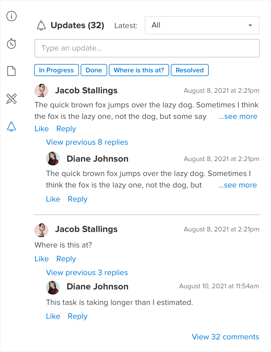
UPDATE STREAM
CONTEXT
You’re a manager that needs a status update on a task of a project. You're on the project page, and you have a list of tasks. When a task is clicked, a detailed summary sidebar will open on the right side. This is where you can see the update stream of the task in that area (pointed arrow).
CURRENTLY
Here's what the current stream looks like.
It shows one parent update and one child comment.
EXPLORATION
Jessica and I got together and explored other mobile comment thread designs such Slack and YouTube. We also generated random ideas like a scrolling bar, listing comments and then viewing all, expanding all the comments in the sidebar. I wanted to get an idea of how other companies design in a comment stream and see if we could try to build off of those.
USER RESEARCH
After exploring some ideas, I thought I should take a step back on the problem. I didn’t really know much about our users and how they were using the update stream, so I decided to conduct a few user interviews internally. The goal of the interviews was to figure out when in the work process do users use updates to gain value for their work.
I created a list of who I wanted to study and a list of questions I wanted to ask.
Jessica helped me recruit 3 internal users. We sat down with 3 people in different departments - an Art Director for Creative Services, a HR Business Partner, and the Engineering Manager from my team.
AFFINITY DIAGRAM
After conducting three user interviews, we made an affinity diagram. Creating an affinity diagram helped us organize our data and findings with common themes of how our users interacted with the update stream.
BRAINSTORMING WITH THE TEAM
I led and facilitated two crazy 8 sessions with UX designers and engineers. You can learn more about the design sprint method here.
Involving everyone in the design process allows everyone to be on the same page and can make the design decision process easier. Since the engineers are the one implementing the designs, they know which ideas are feasible to build.
LOW-FI WIREFRAMES
Jessica and I went over all of the ideas and weeded out any sketches that aren’t feasible and/or won’t help the user.
Jessica and I went over all of the previous ideas to generate one single wireframe.
FINAL
After, I built high-fidelity wireframes.
- Users can filter out between the latest update from everyone or from specific people.
- Users will only be able to view the parent update and the latest child reply.
- Only 2 of the latest parent updates will be shown.
- “View previous 8 replies” signifies that there’s a conversation in between.
- Truncated comments to save vertical real estate.
WHAT I LEARNED
- The rotation program at Workfront exposed me to different areas of the product and allowed me to gain a better understanding about Workfront and how it functions. I was able to contribute to multiple projects in a cross-functional environment (UX/PM/engineering).
- Get feedback often. Collaborate with everyone in team. Have brainstorm sessions with PMs, engineers, and UX. Test and validate your designs.
- I was able experience what it was like to work in a company that truly values design and to be treated as a full time UX designer.
- I was able to present my design work to teams and managers for review and I learned to iterate on feedback.
- Starting a project from scratch, and being able to craft the experience of a brand new product gave me a huge sense of accomplishment. The process was intimidating at the start - there were days where I felt completely lost and stuck, but my mentor helped me find my way.
I wrote more about my learnings here. Feel free to check it out!
CHALLENGES
- Design Systems:
- Components may not always work for certain use cases and can be limiting
- Design systems must be maintained and updated often as the product evolves
- Documents:
- Starting a project by myself from scratch
- No one really knew about the details of this project except the senior PM
- Knowing what features has already been built (Everyone seems to be building different styles of filters)
- Work Execution:
- Constraints of building an update stream within a small space (372 pixels)
- Understanding our users
- Recruiting people
IF I HAD MORE TIME...
- Design Systems:
- Create a version for an overflow toolbar
- Work more on the drag and drop component - there are more use cases I did not define such as bulk selecting rows
- Documents:
- Test the Vault Storage Center with our customers
Design the list view
Work Execution:
- Test and validate the new ideas for the update stream
- Other things to consider - “Like” functionality experience, tagging functionality