What is Amazon SageMaker Unified Studio?
Amazon SageMaker Unified Studio is a data and AI platform that brings together AI and analytics services together into an integrated experience, to enable data processing, SQL analytics, model development and training, and generative AI. With a unified studio, you can access and act on all your data using the best tool for the job.
Timeframe: September 2025 - December 2025
My role and impact
〰️
My role and impact 〰️
Within 1 week of launch, we received 110 external customers trying out the experience
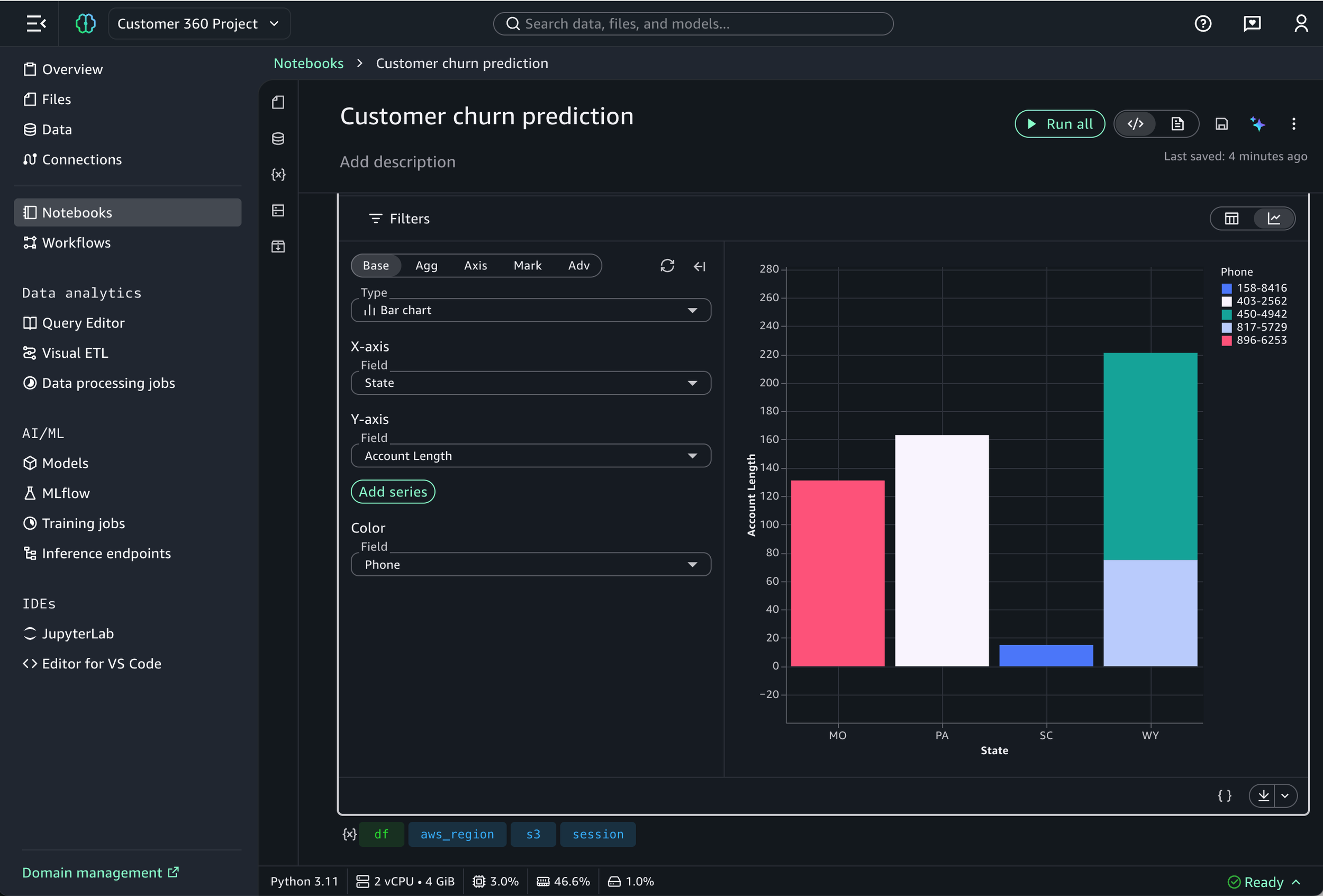
Led the end-to-end designs for Variables explorer, Compute environment, Packages, and data visualization cell experience within the notebook feature

The problem
While JupyterLab (an open-source IDE and tool in Unified Studio) is the industry standard for data science, its "feature-first" design creates significant friction for modern data teams. We consistently hear from customers that despite its power, the environment feels unnecessarily complex—forcing users to spend more time managing their tools than analyzing their data.
Major pain points include:
Cluttered interface with all features visible upfront
Steep learning curve for new users
High cognitive load for basic tasks
Complex compute requirements leading to long setup time
Forced to juggle multiple tools and window-switch to complete a single analysis
The solution
We built a serverless notebook that lets data teams explore, visualize, and build data pipelines without complex setup.
Our goal was to have:
Zero setup needed
AI-assisted coding & debugging
In-line data visualizations
Multiple languages in a single, interactive workspace, eliminating the need to switch between different tools
Sample design process for the packages experience
This is a sample of my design process for 1 of 4 features I’ve designed in this launch. Due to my NDA, I am unable to share all my design artifacts or process publicly. If interested, feel free to reach out as I’m happy to continue deeper discussions.

O1
Discovery
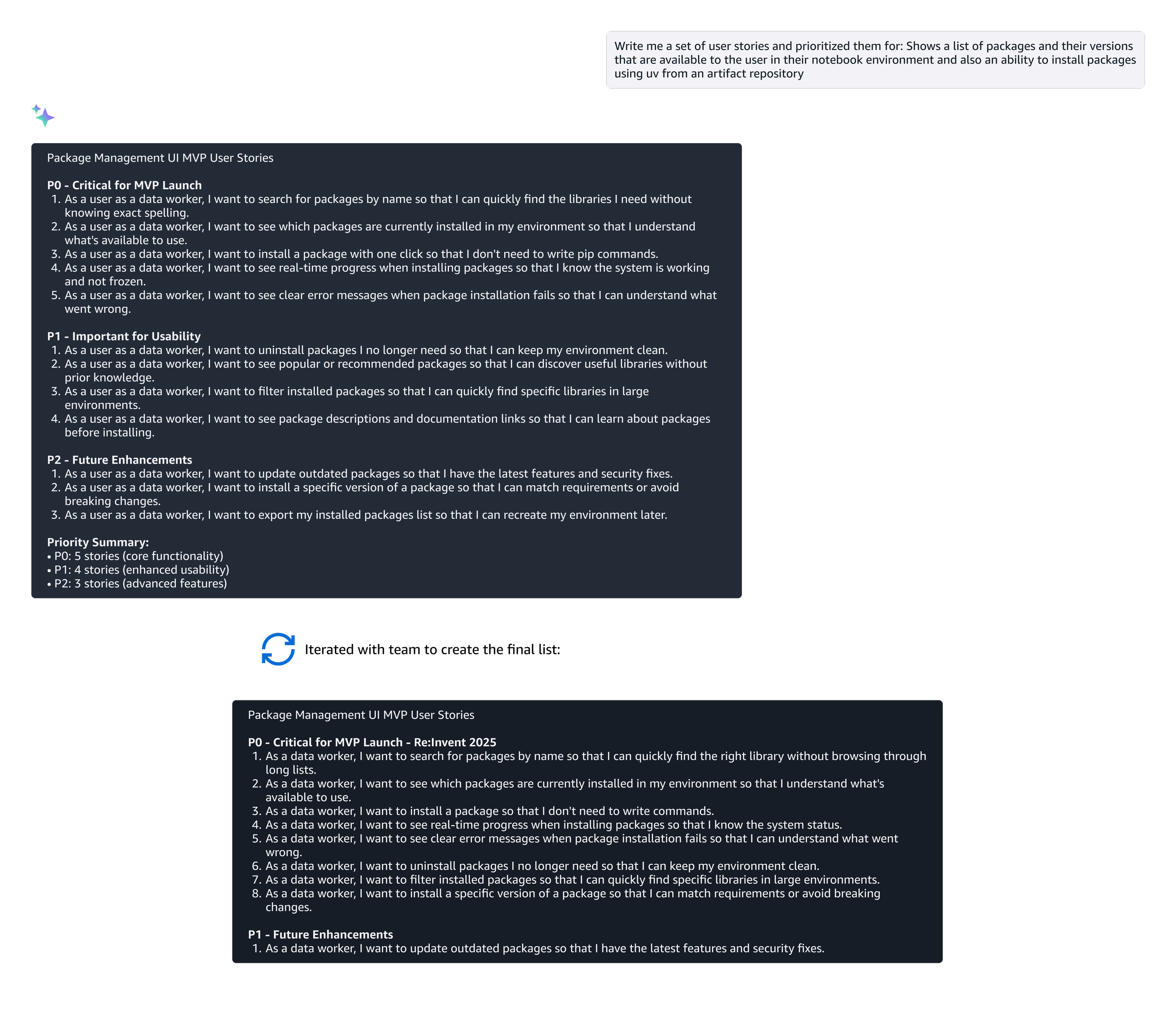
“Shows a list of packages and their versions that are available to the user in their notebook environment and also an ability to install packages using uv from an artifact repository.”
Packages are pre-built toolkits or library of code that adds extra capabilities to the notebook - think of it as an extension or add-on that gives you more features.
For this feature, it began with a single, functional line in a requirements document from the Principal Engineer:
The problem
While the requirement was purely functional, the human problem was much deeper.
Data workers had no visual way to manage their packages within their notebook. Instead, they were forced to write manual code commands for even the simplest updates. This "code-only" approach created a high-friction experience:
Technical barrier: “Code-only” led to frequent errors that were frustrating to troubleshoot
Zero visibility: Users had to know the exact name and version of every library before they even started
I used AI as a partner during the discovery phase to move from these pain points to a design plan:
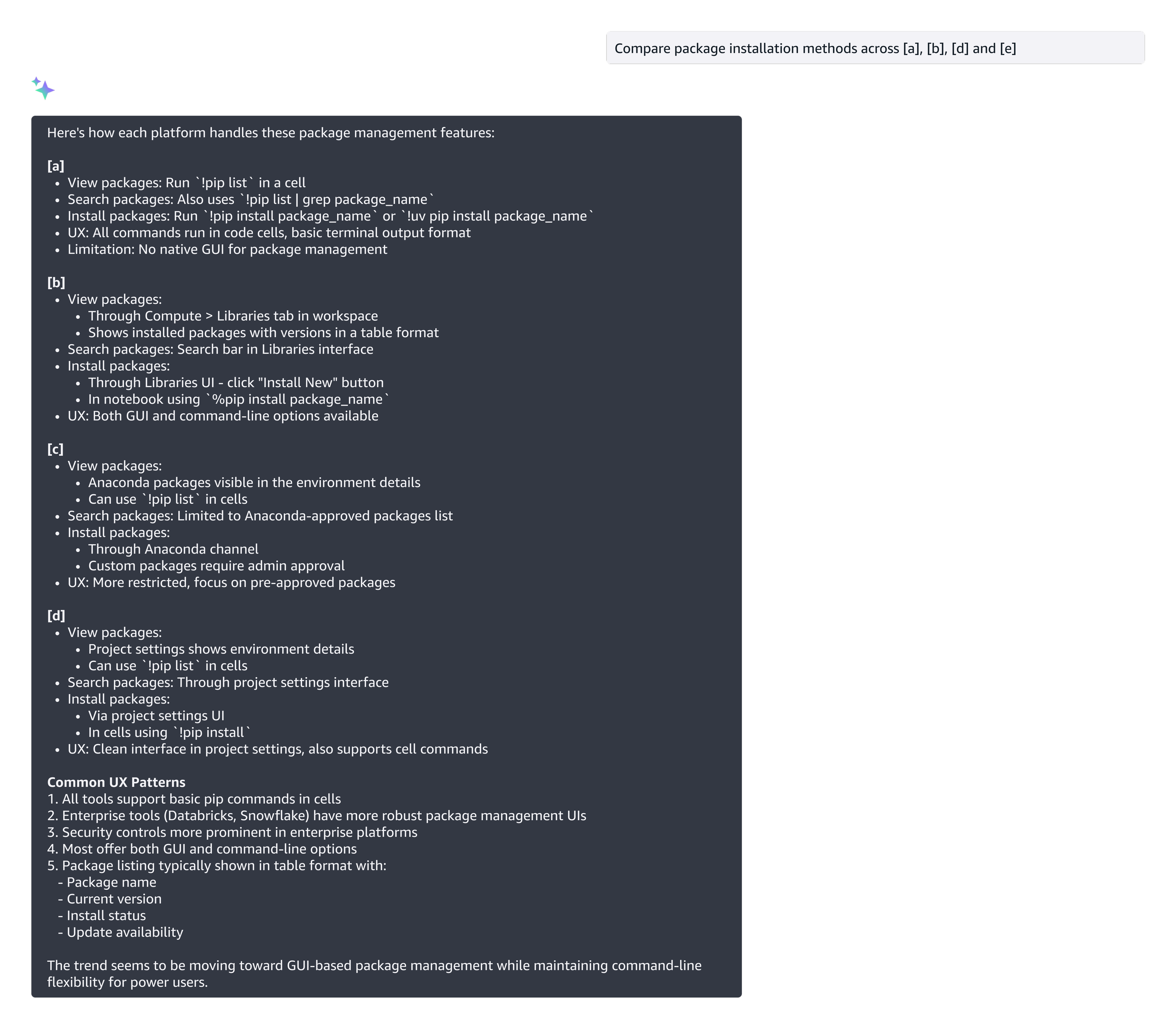
Accelerated research: I used AI to quickly synthesize how other platforms handle their packages experience. This saved me days of manual researching and allowed me to go straight to the strategy.
Drafting user stories to uncover requirements: I leveraged AI to generate a comprehensive set of user stories. This gave me and the team a solid head start in uncovering hidden requirements—ensuring we were aligned on the scope before moving into wireframes.
Some example prompts:
Leveraging AI in the design process
O2
Design
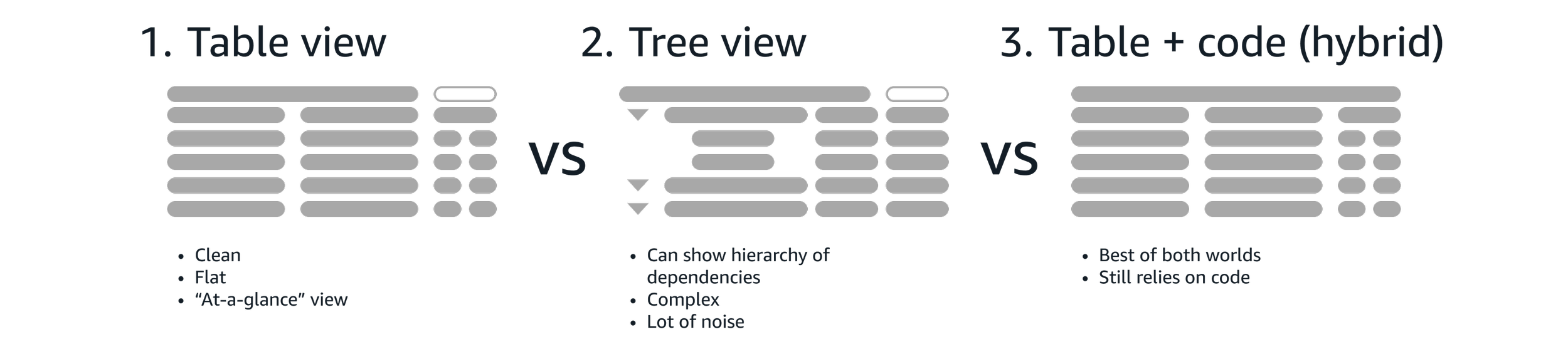
I explored multiple designs - my goal was to find the "sweet spot" between simplicity and the technical transparency that data workers need.
Throughout these iterations, I held regular review sessions with the internal team and bi-weekly sessions with executive stakeholders to get early feedback and alignment.
Some sample design explorations:
O3
Refinement
I participating in multiple UX reviews across the product, I was able to spot a major "UX collision" just two weeks before the beta launch: the Models team was using the same box icon to represent “models”.
I quickly pivoted to design a new, distinct icon, focusing on:
Legibility at 16x16px: Keeping lines simple so they didn't "blur”
Geometric distinction: Intentionally angling the box differently to create an distinct visual break from the original icon
Functional meaning: Adding a small arrow to symbolize "management" rather than just a static package
We had a beta launch to several key customers, conducted internal testing, and a unmoderated study to validate how the experience integrated into their daily workflows.
Beta launch testing
To validate the new design, we utilized the same unmoderated testing script used from V1 experience (JupyterLab) and compared the data with V2 (new redesign).
Tasks
After completing the task, participants answered questions to measure overall complexity and rate their confidence:
Confidence: "I felt very confident that I completed the task successfully."
Ease of use: "I found the steps required to complete this task were very cumbersome to use."
Autonomy: "I felt I could complete this task without needing to refer to external documentation."
Run basic code: Create a notebook and run your a block of code
Add a package: Add the “records” package
Most users were able to complete their package management tasks without friction. However, it revealed an opportunity to tighten the user journey.
I noticed that when users searched for a package that wasn't already in the notebook, there was a brief moment of delay.
In the beta experience, we had a F-pattern reading and interaction style. After searching, users had to scan below for the results, then move their eyes across the screen and to the top to find the "Add".
This resulted in deci-seconds of unnecessary delay and mental friction.
Additional opportunity
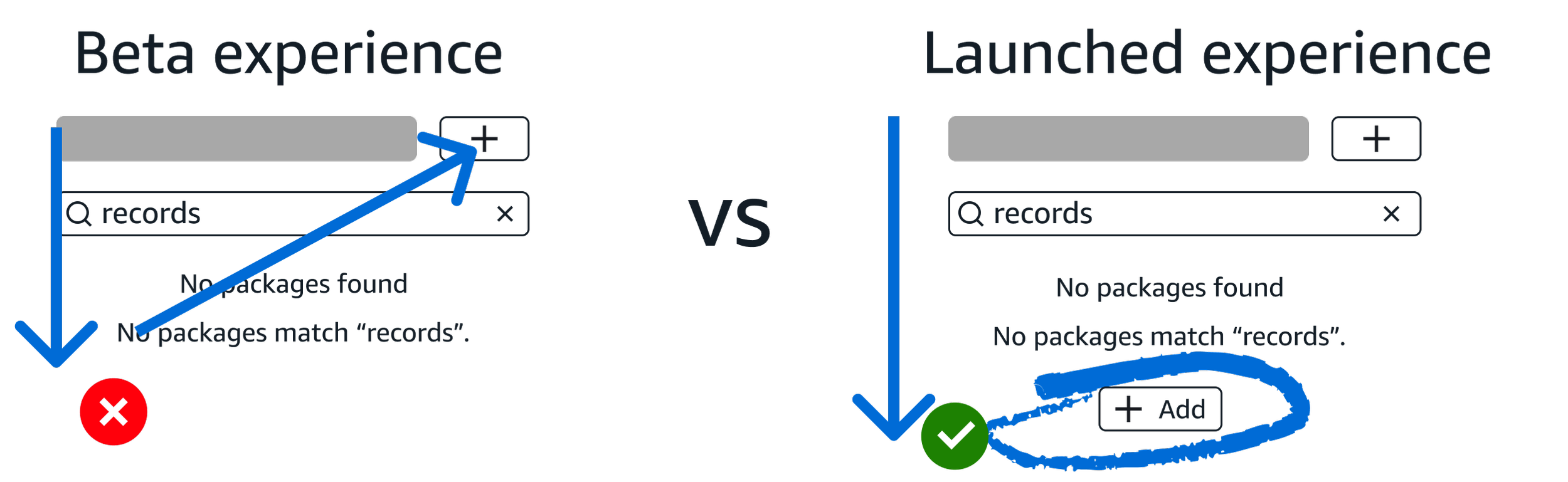
I iterated on the design and placed another Add package button directly below the search result as a call-to-action.
By moving to a vertical, straight-down pattern, I eliminated the horizontal scan. This small change significantly sped up the workflow and made the transition from "searching" to "adding" instantaneous.
The solution
Throughout the process, I identified and submitted 105 bugs ranging from large UX gaps and pixel-alignment issues.
By beta launch, only 5 minor bugs remained, ensuring that the feature our users saw was polished, professional, and reliable.
Design QA
O4
Launch 🚀
This feature was shared on the main stage as an Innovation Talk at AWS Re:Invent 2025 and in multiple technical deep-dive sessions.
“A few of my favorite things:
1. A production-aligned package management experience
At first, I was confused when I couldn’t use an in-notebook pip install, but I’m a big fan of the kernel package manager. The GUI for installing dependencies reminded me a bit of RStudio, and I’ve always loved that model. It’s clean, visual, and makes it easy to click a button to add packages and instantly see versions.”
Sample final screens I’ve designed and launched for Re:Invent 2025
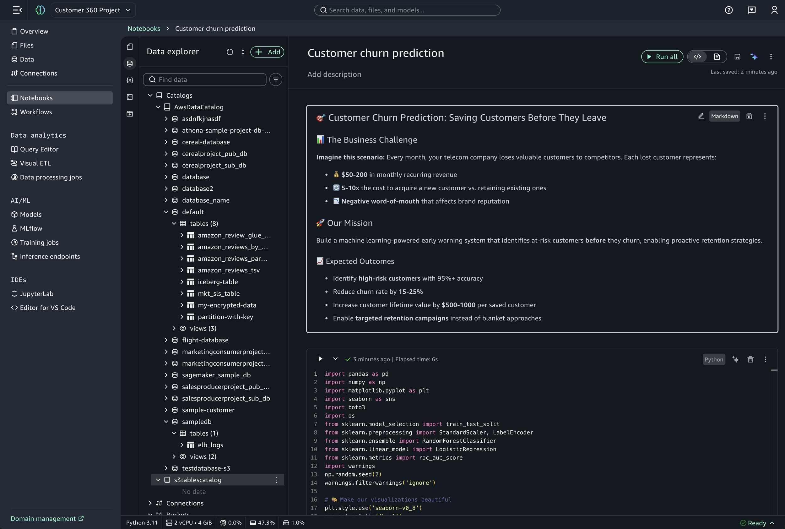
Data explorer
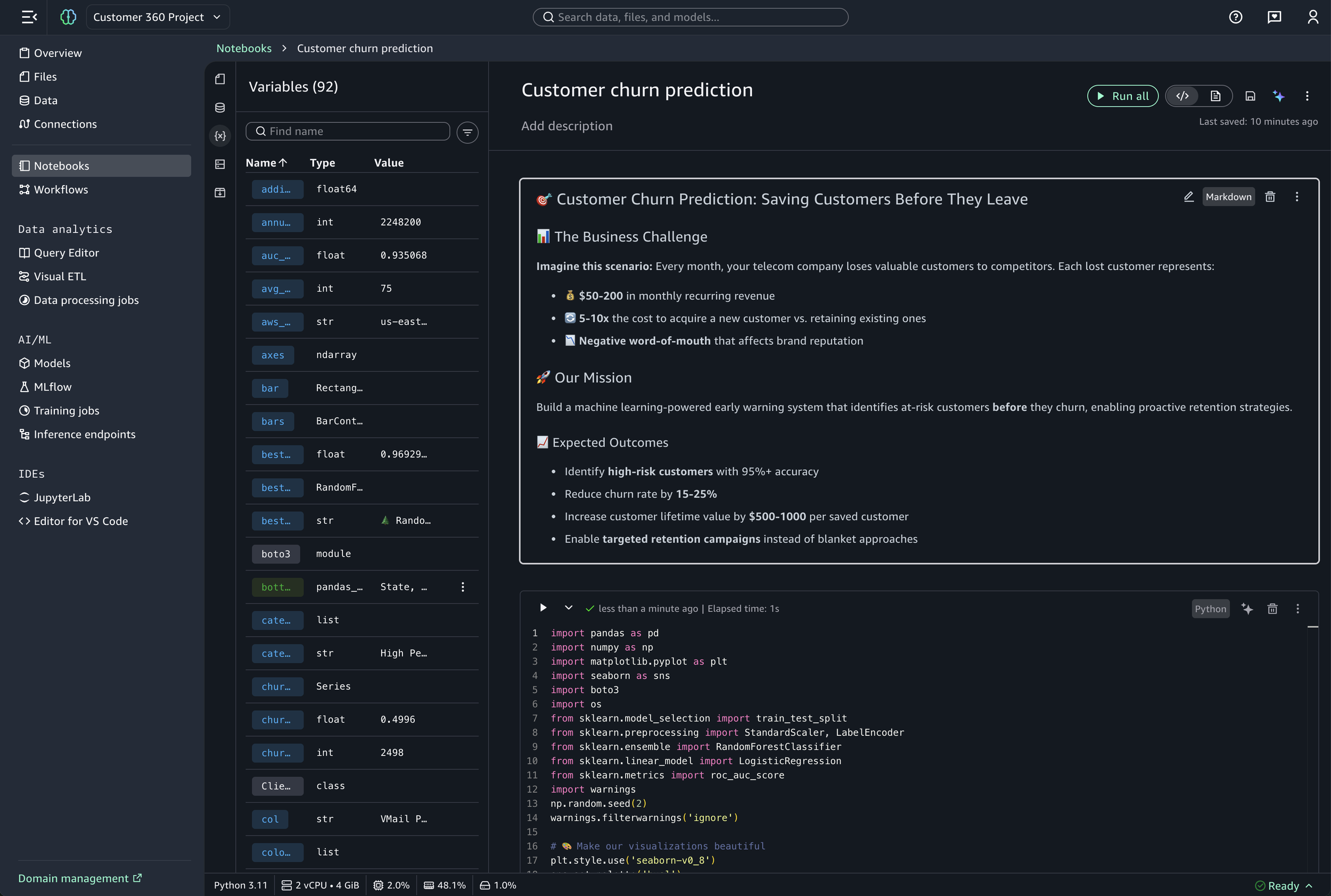
Variable explorer
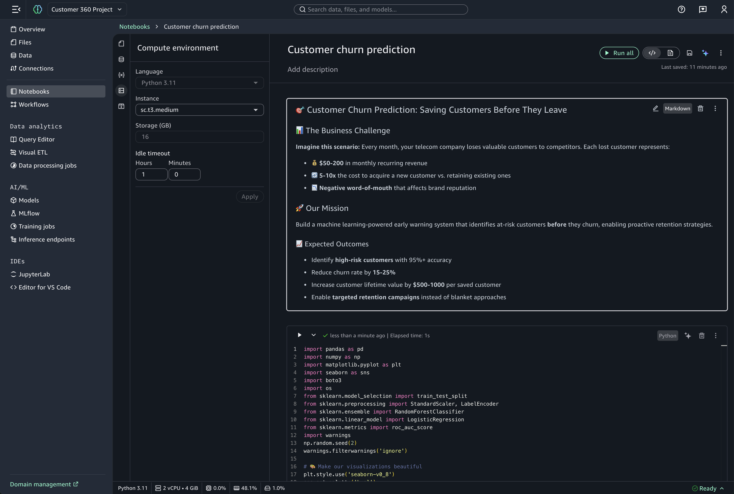
Compute environment
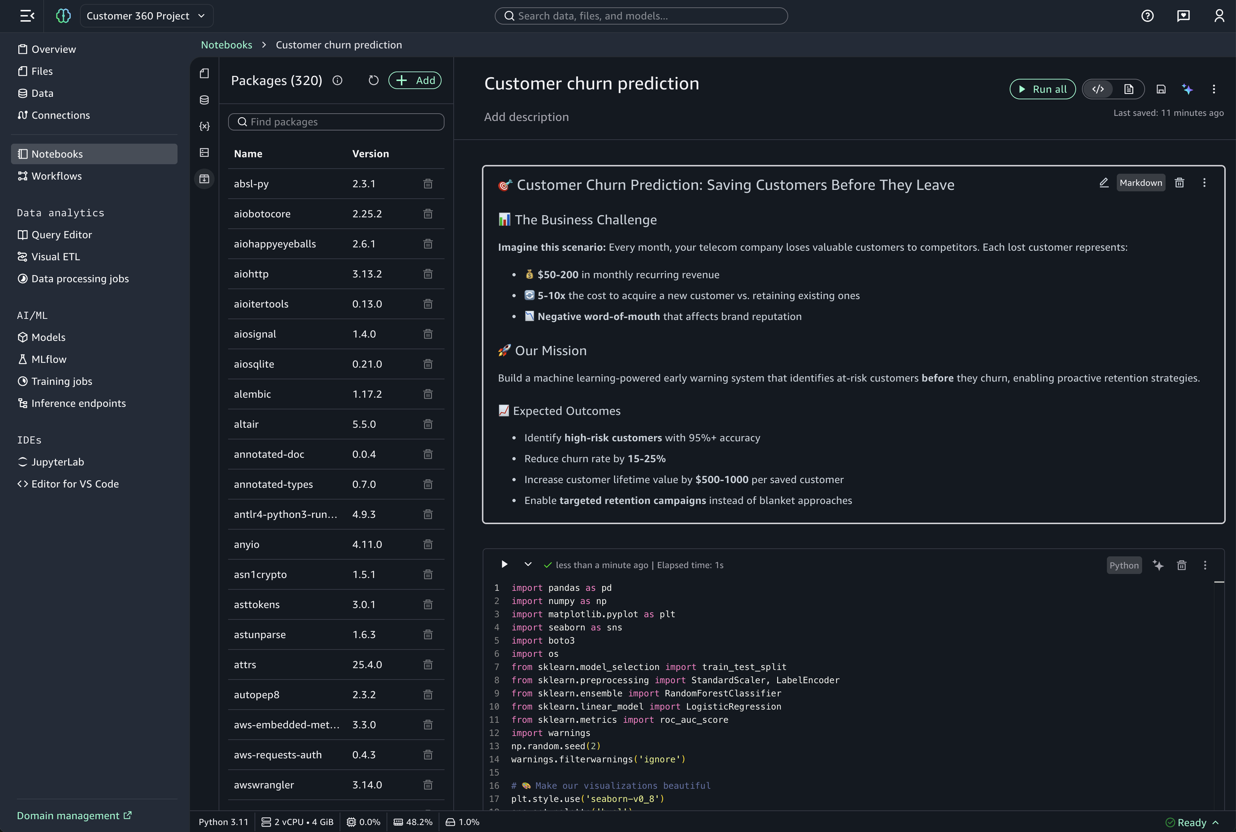
Packages
Data visualization cell
Challenges
Stakeholders and executives wanted more features beyond the defined MVP scope
I had to continue to push back on what we can deliver
Designers were ahead of the design system in component building - new components needed weren't yet available
Close collaboration with the design system team was required
Lack of spacing specifications from the design system
I defined the spacing based on the 4px grid
Project required a lot of custom components
Custom components required mapping to the color palette without design system support
If I had more time
Component documentation - Create detailed documentation for custom components of all color mappings and spacing decisions
Interaction design polish - Spend more time on micro-interactions and delight
What I learned
First project that I’ve leveraged and integrated GenAI at different points of the design process
Systems thinking over silos by participating in cross-UX reviews
Ensured the product feels cohesive rather than a collection of silos
High-stakes pivoting
I maintained a high bar for design craft in short deadlines
The “last mile” of launching a feature is very critical
When 10 bugs are fixed, 5 more may come up